Creative Dataviz Project
A creative datavisualization project demonstrating the rise of global temperatures and related trends
NB: This page will only include a summary of the project. To see the whole project → Read my full report here
My project focus was on the rise in global temperatures and the trends surrounding it, aiming to use the power of visualization to convey the data in a more meaningful way. The goal was to create an interactive webpage with visualizations built using d3.js, designed to help users not only learn something from the data but also explore it in their own terms.
I ended up using a total of five different datasets from Our World In Data:
- Global temperature anomalies by month
- Global warming: Contributions to the change in global mean surface temperature
- Carbon dioxide concentrations in the atmosphere
- Ice sheet mass balance
- Sea level rise
Prototyping
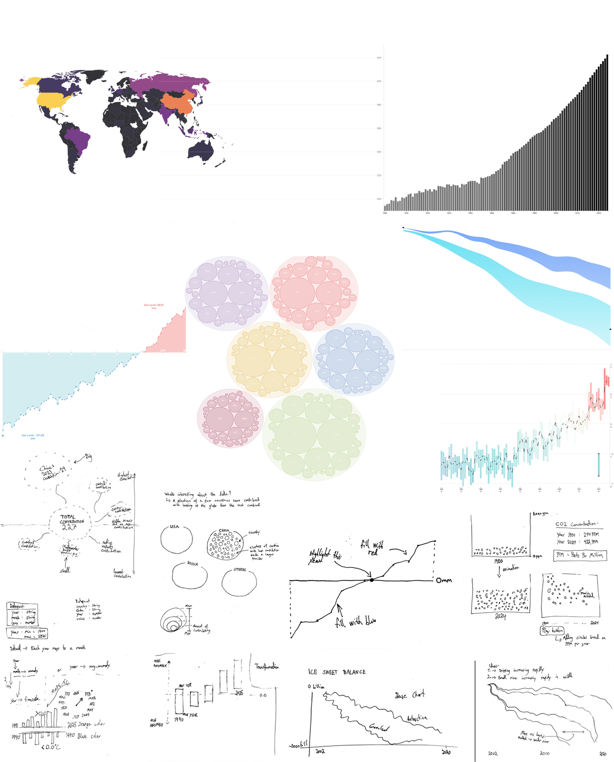
I used d3.js a lot during this stage, mainly to explore the data, try out different ways of structuring it, and see what formats would work best for the kinds of visualizations I had in mind. At the same time, I sketched out different ideas for how the visualizations could look. Going back and forth between working directly with the dataset in d3.js and sketching helped me figure out what worked. I found that just playing around with the data often revealed interesting patterns or details I hadn't noticed before. Once I saw those, it became easier to sketch ideas that put the most interesting parts of the data in focus.
The figure below shows a selection of sketches (low-fidelity prototypes) alongside some of the SVG visualizations created with d3.js (high-fidelity prototypes):
The Full Story
So the webpage ended up with a lot of different visualization built with d3.js, but it's necessary to zoom out and look at the project as a whole. That was my main goal throughout this process, and it's also reflected in how the webpage is designed. The structure tells a story, moving through one dataset at a time, where each visualization naturally leads into the next. Each section takes up the full height of the screen to make the visualizations large, clear, and easy to focus on. As users scroll, one visualization smoothly pushes the previous one up, reinforcing the sense of connection between them.
The figure below shows each screen from the webpage, with an arrow simply indicating how the next section would appear beneath the last one to the left:

As users scroll through the webpage, each new visualization is animated as it comes into view. I added these animations to make the experience more dynamic and engaging. Simple effects, like a line chart gradually drawing from start to end, or the “rivers” in the ice sheet visualization flowing from the top left to the bottom right, help bring the visualizations to life and make the data feel more vivid and immersive. I included a sidebar, helping the viewer's keep track of where they are in the process and how much more is left. The sidebar also allows users to click the different topics and the page immediately scrolls to that section.
Together, the structure, animations, and flow of the webpage was designed to guide the viewer through a connected journey, from CO2 emissions and global temperature changes to melting ice and rising sea levels. By placing each dataset in sequence and using visual storytelling, the aim was not only to present the data clearly, but to create a sense of buildup and context.
Reflections on Project
Looking back at my project I realize that my personal step-by-step process of exploring and discovering how the data was related, directly influenced how I built the final project. The website is designed like a journey, guiding the user through each dataset in a specific order. Each visualization leads to the next one, and this sequence, from CO2 emissions and temperature changes to melting ice and rising sea levels, mirrors the same process I went through when I explored and analyzed the different datasets.
The visualizations, made with d3.js, act like guides on this journey. By putting the datasets in a thoughtful order and using visual storytelling, the goal is not just to show the data clearly, but also to create a sense of flow and understanding. Animations make the experience more dynamic and engaging, helping bring the data to life. The structure, animations, and overall flow of the website are all meant to take the user on a connected journey, giving them a better and deeper understanding of climate change.